The Narrative of Color
Color in a woodblock print is never applied just once. It is built — layer by patient layer — until the surface holds a depth that takes time to fully absorb.
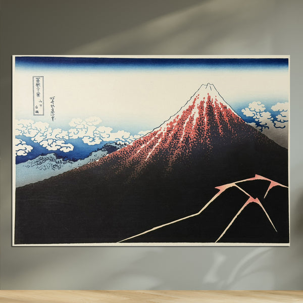
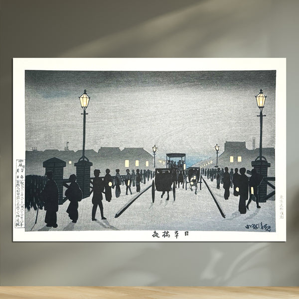
MOK Arts approaches each piece through this historical lens: exploring not simply what shade was chosen, but why. The indigo trusted by samurai families, or the subtle grays refined by Edo townspeople forbidden from wearing bright dyes. Every pigment carries a quiet history, and every impression makes that history visible.
Japan's unnamed colours
In Japan, color was named, not just seen — capturing a single fleeting instant, or the slow, layered shift of one season into the next. Here, ten traditional colors, each opening onto the prints that carry it.
A pure white, like silk threads washed to remove their natural yellowish tint. Used in sacred rituals and noble garments, it highlights the inherent beauty of natural materials.
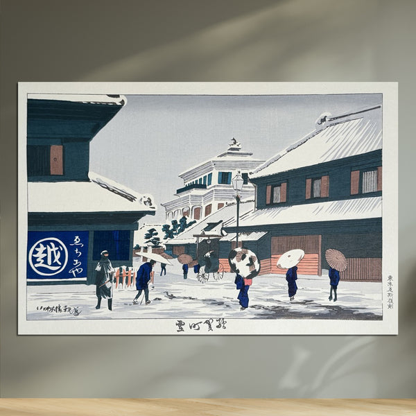
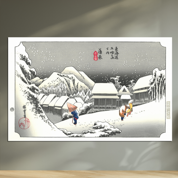
A soft, pale yellow like a full moon floating in the night sky. Reminiscent of quiet moonlight, it possesses a calming gentleness.
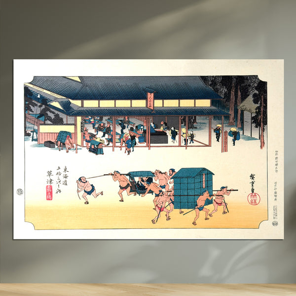
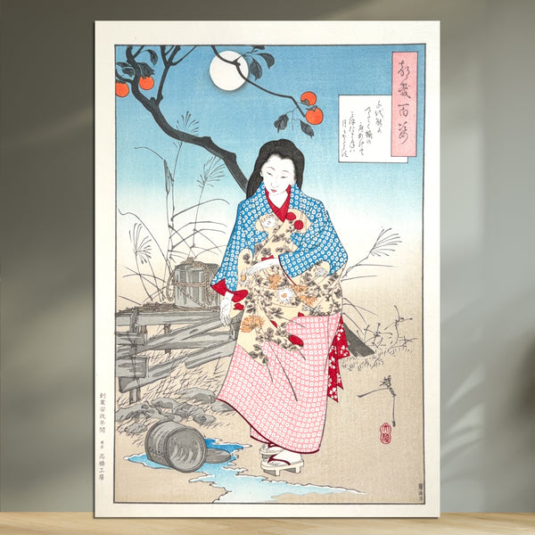
A rich, powerful yellow like shining gold. Often compared to the color of ripe rice ears, it has been cherished as a symbol of abundance and prosperity.
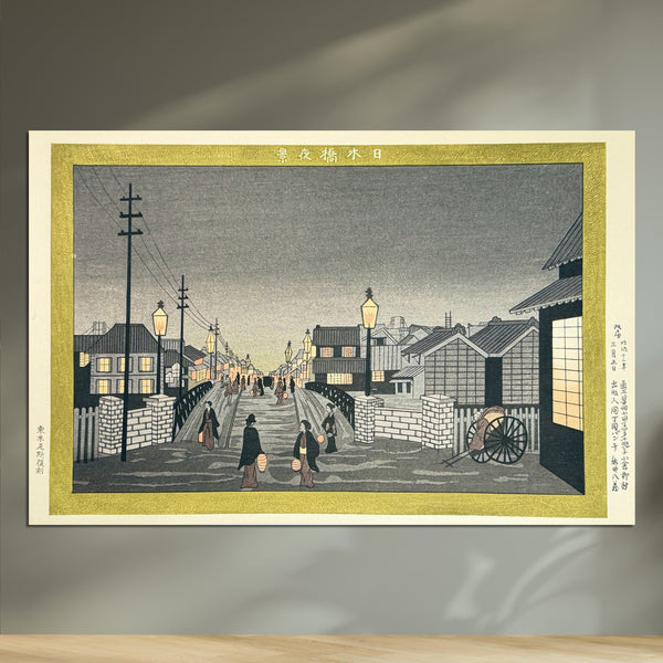
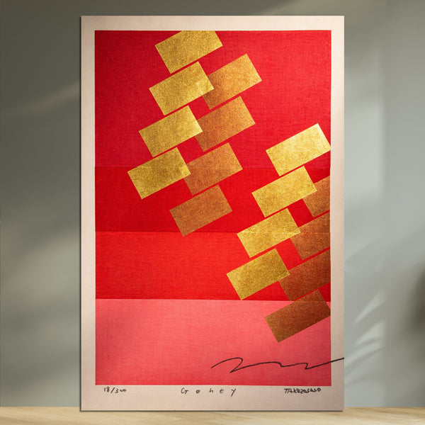
A very bright, vibrant red with a slight yellow tint. Popularized alongside modern printing techniques, it possesses a modern strength that instantly catches the eye.
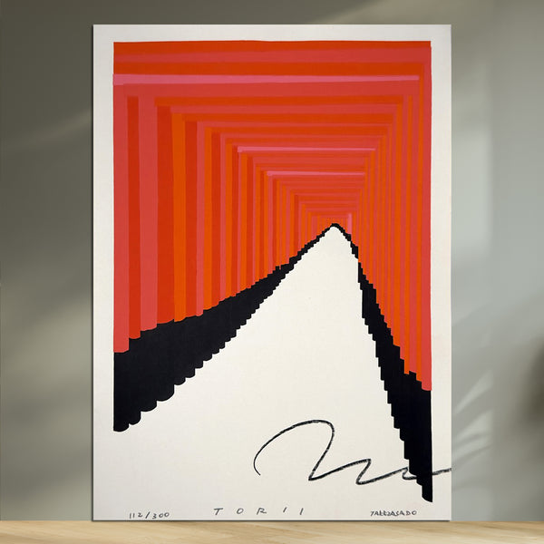
A remarkably rich and vibrant red. Traditionally dyed using madder and ash, it carries a subtle hint of yellow. During the Nara period, it was a color of high prestige—second only to purple—and was strictly reserved for the nobility.
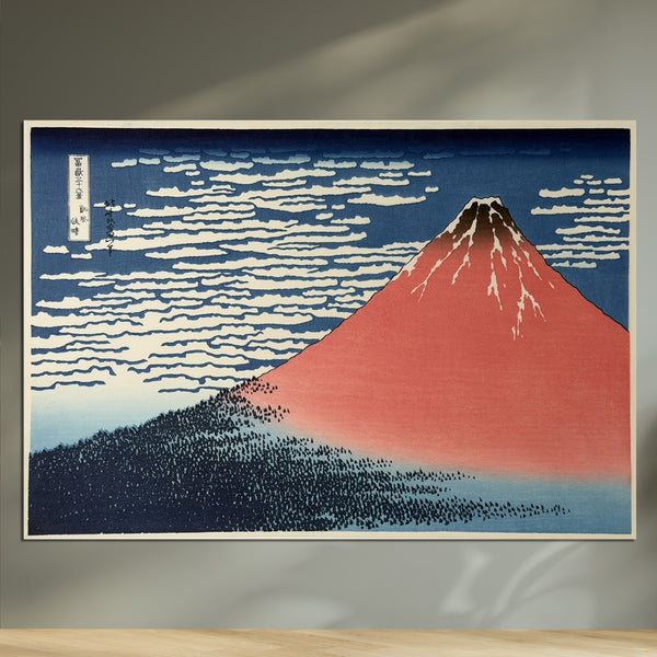
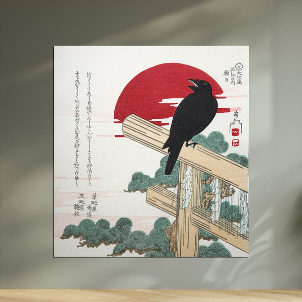
A very pale purplish-pink, resembling the petals of blooming cherry blossoms. As the quintessential color of Japanese spring, it captures both fleeting beauty and grace.
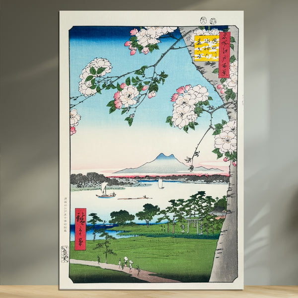
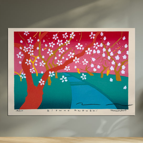
A sophisticated greyish-green, blending matcha green with subtle grey. Named after the tea master Sen no Rikyū, it became immensely popular as a chic color during the Edo period, embodying the aesthetics of the tea ceremony.
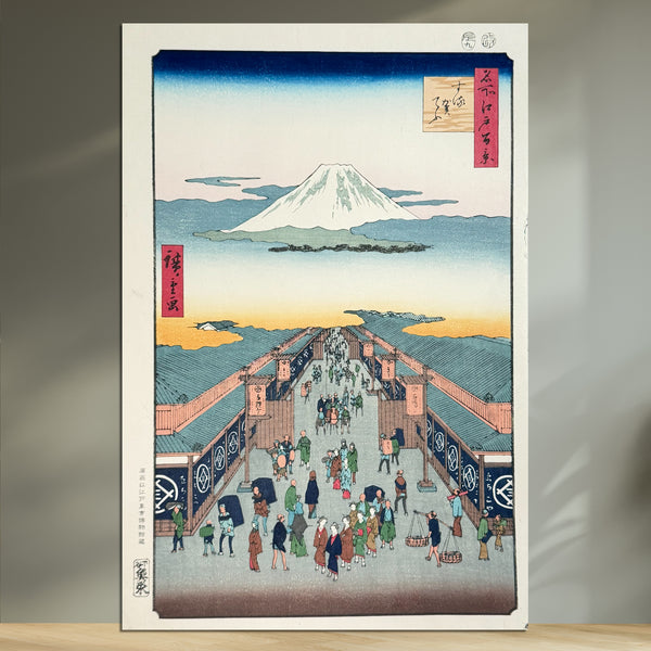
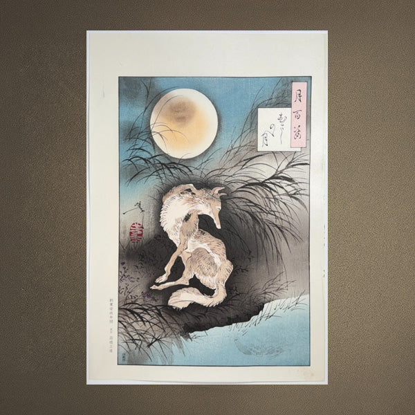
A vibrant yellow-green, like young leaves sprouting in spring. Symbolizing vitality and youth, it was a favored color for the garments of young nobles in the Heian period.
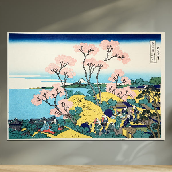
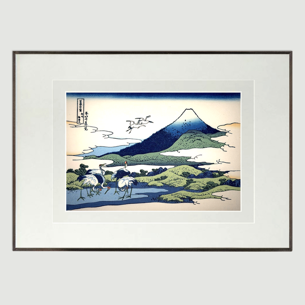
A dark, purplish-blue that adds depth to lapis lazuli. It became a popular color for kimono during the Edo period. It is a refined shade where tranquility and strength coexist.
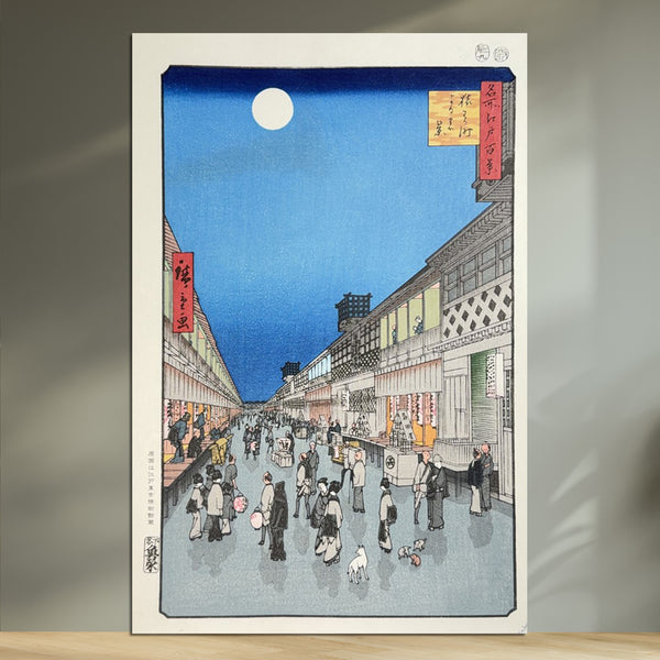
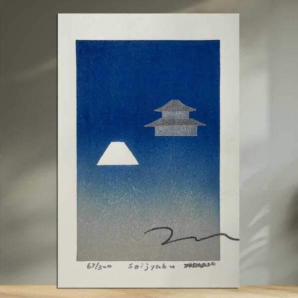
A deep, calming black inspired by traditional calligraphy ink. It carries a faint grayish hue, offering a softer impression than pure black. Historically, it was favored for the daily wear of monks and literati.